Branding
Oxide Training Branding
Branding Design
The Oxide Training logo is built on a powerful visual language that symbolizes modern technology and development. The green symbol in a geometric shape represents sustainability, renewal, and growth, while the simple and clean lines emphasize professionalism. The minimalist typography supports the brand's education-focused, reliable, and innovative approach. The contrasting colors used on a dark background enhance the logo's appeal, creating a strong brand image across all digital and corporate platforms.
The Oxide Training logo features a contemporary design that reflects discipline, consistency, and an advanced approach to learning. The green geometric icon symbolizes transformation and progress while also conveying a sense of technological structure. The balanced use of typography emphasizes the brand's systematic and determined educational vision. Thanks to its minimalist design language, the logo offers both a modern and timeless identity, supporting the brand's strong position in the industry.
Corporate Identıty

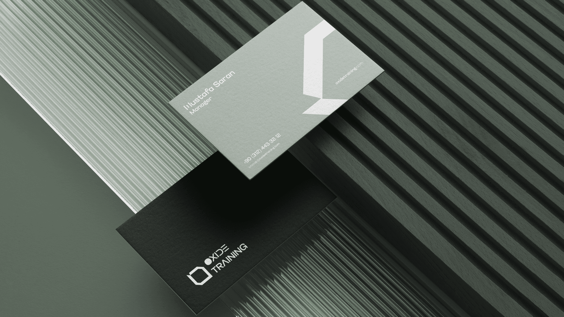
Business Card
Logo Design
The Oxide Training logo has a modern and minimalist structure. The green geometric symbol represents growth, renewal, and sustainability. Sharp and clean lines emphasize the brand's disciplined and professional approach to training. The use of simple typography and a dark background creates a strong, technological, and trustworthy identity for the logo.
Corporate Identity
This corporate identity design reflects the modern, disciplined, and professional structure of the Oxide Training brand through a comprehensive visual language. Geometric lines derived from the logo form symbolize continuity, direction, and development, while ensuring a consistent flow across all materials. Matte gray and dark tones reinforce the perception of trust and seriousness, while simple typography emphasizes readability and corporate identity. Minimal layouts are preferred in applications such as business cards and letterheads, highlighting the brand's clear, organized, and contemporary approach to education.
Timeline
November 2025
Project Presentation
View Work